
Take a peek: Jessica Hische
 Lope, our Art Director, is a type freak. Longtime editor of Platanoverde Magazine in Venezuela, he dreams in highly stylized type-text and drools at the sight of Futura. When curating portfolios for our first edition, our dear Lope almost seized with delight. The reason? Jessica Hische.
Jessica graciously provided enough images to fill two portfolios and answered our many many questions. We were going to make you wait for the print edition for all the goodies we have in store but what the hell, we’re too excited. So we’ve decided to let you have a peek at our interview with Jessica. The full interview is in our print edition out soon.
————————————–
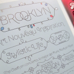
Jessica Hische is a Brooklyn-based illustrator and designer whose imagination runs on coffee. She specializes in hand-lettering and unabashedly declares that her true love is typography. She also keeps a blog, which you should check out right this minute.
How would you describe your work to someone unable to see it?
Warm, fun, feminine but not too sweet.

Do you have any style references you find yourself going back to?
I’ve been exposed to A LOT of great type and design while working for Louise Fili, I feel like I have a mental catalog of sorts from repeated exposure to a lot of 20’s-40’s type. Color-wise I subconsciously use colors around me all the time. The other day I made an illustration with the colors from my morning commute over the Williamsburg bridge: warm gray (asphalt) and dark gray (shadows on the asphalt), faded red + a warm faded blue (the bridge itself), an orangey yellow (the stripes on the road), and white.
Some of your work has been copied and used without permission: what is your take on sharing content and how have you handled plagiarism of your work?
I am of course very against plagiarism of any kind. I try to reserve my reactions for when it is really obvious though so I don’t look like I’m policing the internet for art thieves. I have definitely written an email or two to people that use the term “inspired by” a bit too loosely and strongly worded emails to people that don’t acknowledge their “inspiration”. I’m always really thankful when people alert me to work they see online that is either a misuse of my work (taken from other sites and used without permission with other articles (design blogs excluded of course) or a plagiarized version of my work. I’m actually thinking of letterpress printing a little “Certificate of Valor” to send to other designers and illustrators that point out plagiarists to me.
You hand-letter using illustrator and have said you spent time drawing on your trackpad, but can you draw? And will you ever purchase a tablet?
I can draw, but after a few years of computer only drawing (when it comes to type), I’m just so much more efficient on the computer. And also I definitely mentally “Command-Z” when I’m trying to draw in real life (horrible I know) and am frustrated when the eraser can’t quite wash away my mistakes. As far as purchasing a tablet, maybe, but I hold a pen like a child holds a crayon (in a tight fist that will only catalyze the carpal tunnel).


Leave a Reply